Choosing the right call-to-action (CTA) for your website is crucial. It can make the difference between a visitor who leaves and one who converts into a lead or sale. In this blog post, we’ll break down how to choose the perfect CTA for your SaaS website.
What is a Call-to-Action?
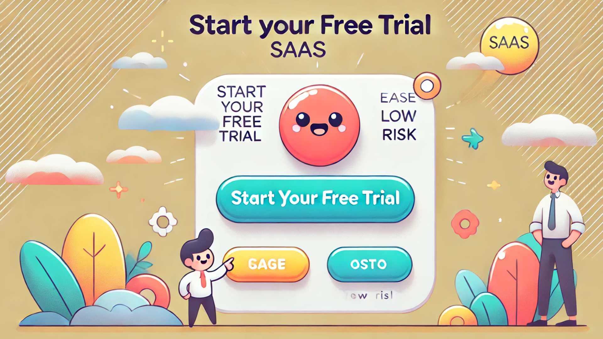
A call-to-action is the button or link that prompts your website visitors to take a specific action. For example, on an e-commerce site like Amazon, the CTA is often “Add to Cart.” For a SaaS website, the CTA might be “Start Your Free Trial” or “Request a Demo.” The effectiveness of your CTA plays a significant role in how well your website converts visitors.
Why is the CTA So Important?
The CTA is often the single most important element on your website. It’s the action you want visitors to take before they leave your site. A weak or unclear CTA can result in low conversion rates, meaning that most of your visitors leave without taking any meaningful action. For SaaS companies, this could mean fewer sign-ups, fewer leads, and ultimately, fewer customers.
Common CTA Mistakes to Avoid
Before we dive into what makes a great CTA, let’s look at some common mistakes:
-
Low Perceived Value: A CTA like “Contact Us” doesn’t offer visitors much value. Visitors need to feel like they’re getting something worthwhile in return for their action.
-
High Perceived Risk: If your CTA requires visitors to fill out long forms or provide too much information, it can scare them away. Keep it simple and minimize the perceived risk.
-
Burying the CTA: Many websites place their CTA at the bottom of the page, where it might be missed. Your CTA should be prominent and easy to find.
-
Unrelated to Sales Process: A CTA that doesn’t align with your sales process, like “Subscribe to Our Newsletter,” might not lead to meaningful conversions.
What Makes a Perfect CTA?
To design a perfect CTA, consider the following components:
-
High Perceived Value: Your CTA should offer something valuable. For example, a “Free Trial” or “Get a Free Demo” button is enticing because visitors know they’re getting something for free.
-
Low Perceived Risk: Make it easy for visitors to take the first step. For example, asking for just an email address instead of a lot of personal information can lower the perceived risk.
-
Placement and Visibility: Your CTA should be placed where visitors naturally look. It should be prominent, with a clear button that stands out on the page.
-
Alignment with Customer Journey: Your CTA should guide visitors through the buying process. For example, a “Request a Demo” CTA makes sense if the next step in the customer journey is to see your product in action.
How to Create Your Own CTA
To create an effective CTA, start by mapping out your customer’s journey. Where are they now, and where do they need to be? Your CTA should help move them closer to their goal.
For example, if your SaaS product helps businesses manage projects, your customer might currently be struggling with disorganized workflows. The goal is for them to streamline their processes. A CTA like “Start Your Free Trial” can move them closer to this goal by giving them access to your tool.
Keep Developing your SaaS CTA
- Test and Optimize: Don’t settle on the first CTA you create. Test different versions to see what works best.
- Keep it Simple: A clear, concise CTA is more effective than a complicated one.
- Make it Relevant: Ensure your CTA is directly related to your product or service, and aligns with what your visitors need.
In conclusion, the perfect CTA can significantly impact your conversion rates. By offering high value, reducing perceived risk, and aligning your CTA with the customer journey, you can encourage more visitors to take action on your website. If you need help designing or optimizing your CTAs, don’t hesitate to reach out for expert advice.
Startup Hub